Setting the first navigation standard in a hospital software with no design culture.
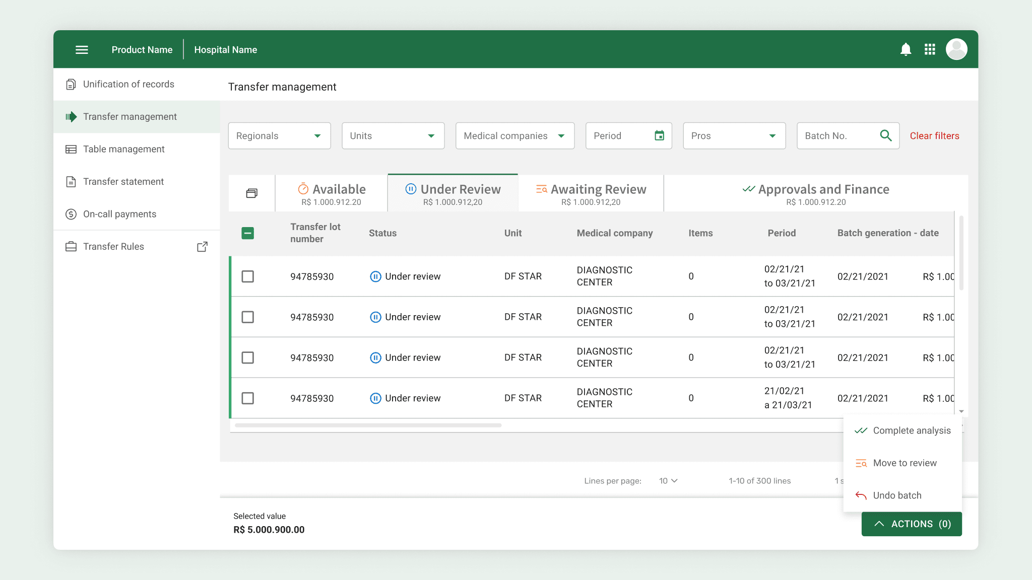
If every new requirement became another button, how would the product scale?
More buttons were not the problem.
The software was built without usability review. Every screen invented its own hierarchy, and a request to add one more action exposed the real issue: there was no shared model for how actions should behave.
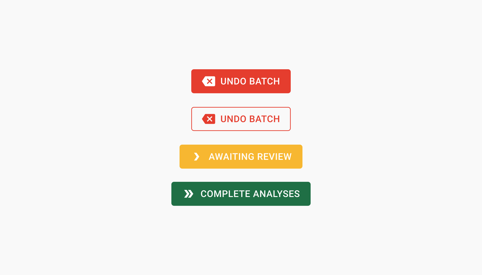
One action model for every state.
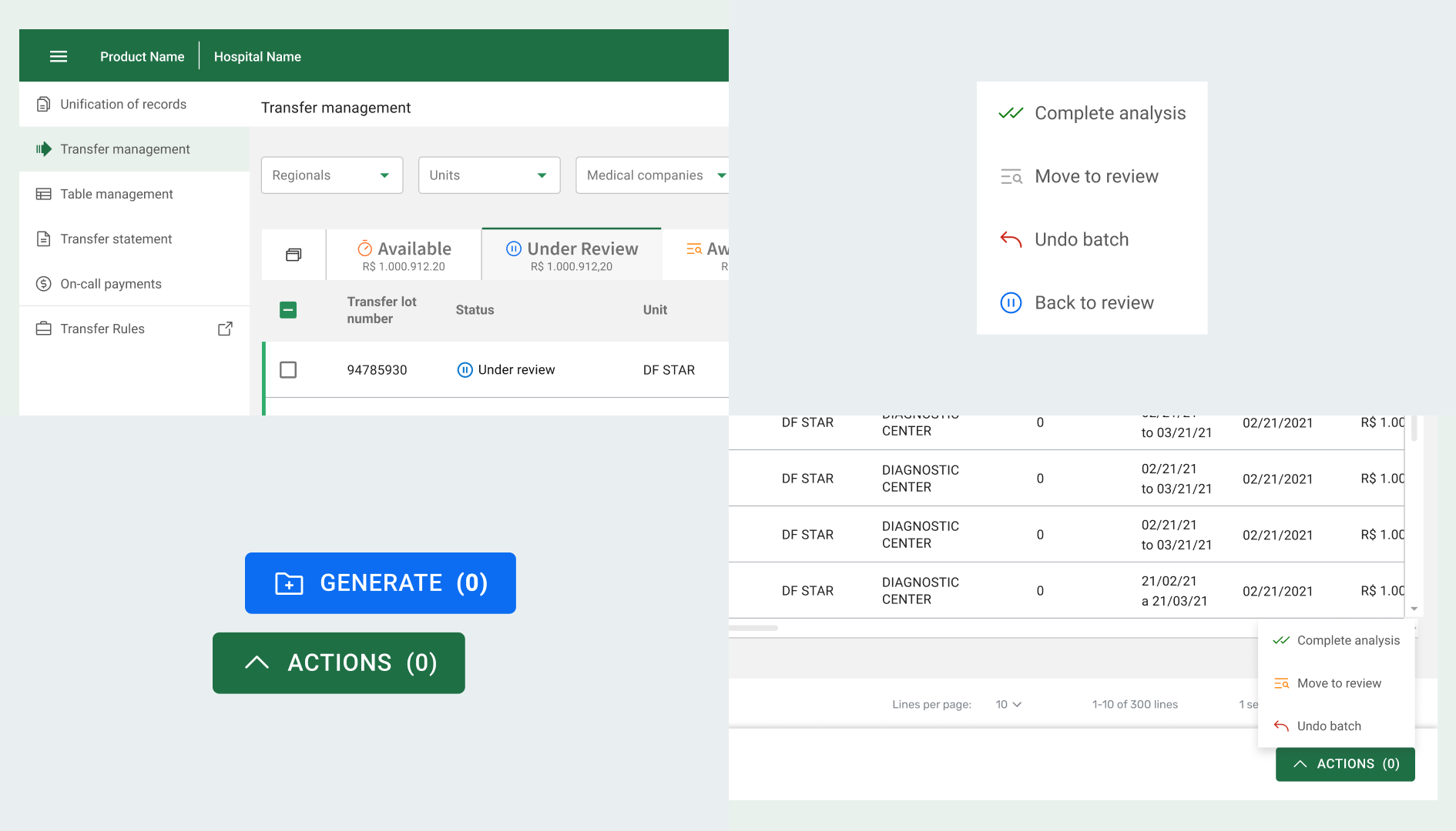
I mapped the existing flows with the P.O and business team, then consolidated contextual actions into one fixed component activated by selection. The system could now adapt to the user's current state instead of adding another one-off control.
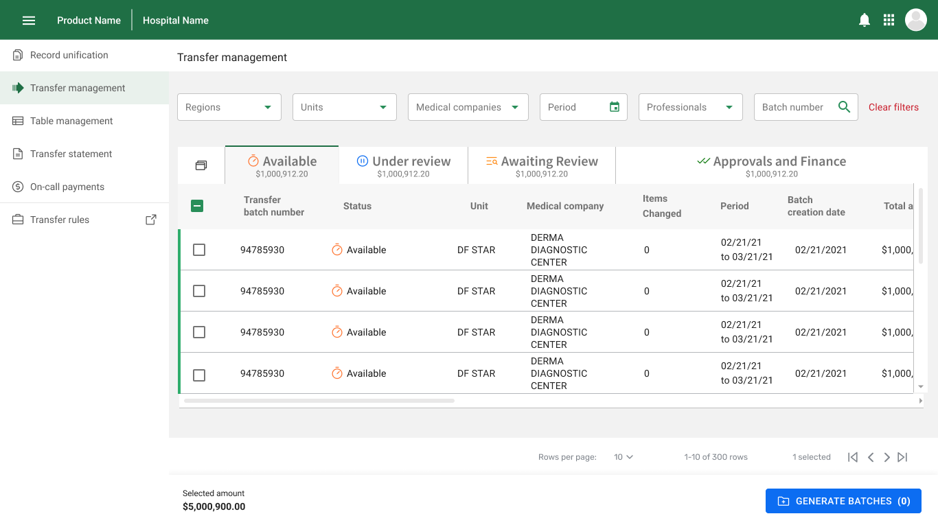
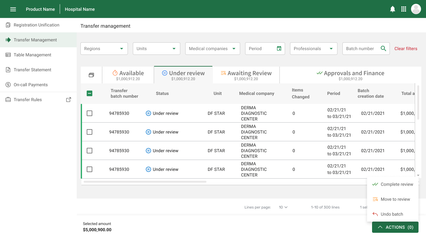
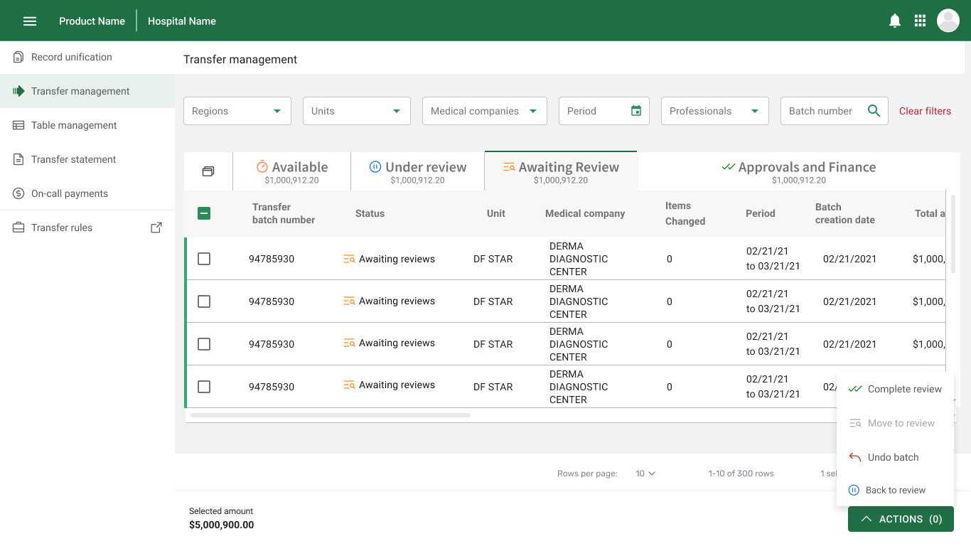
The interface had to prove it was better.
I ran the product's first unmoderated usability test with real hospital employees, using three daily scenarios: generating a batch, moving multiple batches, and reversing an action.
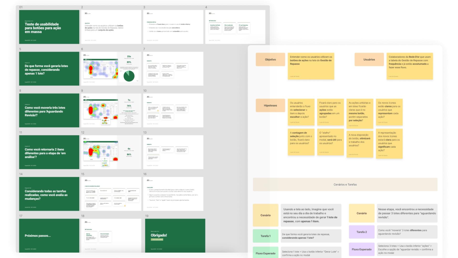
The pattern scaled without asking people to learn a new way of working.
The pattern was reused across the flow without changing the user's mental model. What began as one action menu became a shared product pattern — and a repeatable way for the team to validate and ship it.
The biggest outcome was not the button. It was turning a better product process into something the team could repeat.
This project taught me that in environments without a design culture, the most important delivery is sometimes not the interface itself — it's demonstrating that the process works. Introducing the company's first usability test was as relevant as redesigning the navigation.
If I were to do it again, I would have set up a structured post-launch metrics routine from day one, even a lightweight one — behavioral data would have made the argument for future projects much stronger.